Using spacer blocks to layout your Squarespace web page
Sometimes the simplest of tools are the most useful! Enter… the Spacer Block. Consider this your best bud when beginning your website page layout in Squarespace.
If you’re just getting started using the Squarespace platform to create websites, you may find that when you start adding text blocks or images and try to arrange them on the website page you’re designing, the blocks are huge and make things difficult to manage. You click to add an image block and realize the image is spanning the entire width of the page… which is not what you wanted.
Bring in the spacer block. This little gem will help you properly space out your page layout BEFORE you begin adding text and images.
And the magic doesn’t stop there. The spacer block has other really useful functions that perhaps you hadn’t discovered yet.
*UPDATE SEPT 2022: Squarespace has released an update to their 7.1 platform called FLUID ENGINE, a drag-and-drop page editor that replaces the Classic Editor described in this blog post. At this time, it’s an "optional” upgrade that can be utilized for existing 7.1 platform users, but that may change in the future. Please click here to read more on the new FLUID ENGINE update.
The Squarespace spacer block
To understand website page layout in Squarespace, you need to know that the platform is built on a 12-column-grid system. So each Squarespace “block” or element that you add will span across 12 columns… unless you add other blocks next to it. Each element/block will span at least 1 of those columns, with your remaining element(s) spanning the rest of the columns. Here’s an example below of some possible layouts for achieving even columns.
Another important tip to note is that Squarespace reads these block left-to-right and top-to-bottom. So if you place an image on the left, with a text box on the right, switching to mobile view you’ll notice that the image is now on top of the text box. This keeps things responsive and mobile-friendly.
What can Squarespace spacer blocks help with?
1. Spacing out your website’s header banner
Spacer blocks are great for getting your header spaced out just right. Typically with an image as a background, you’ll add your text blocks on top, but your text may not wrap as well as you’d like it to. Or you may want to create more space above and below your text blocks. See the before/after example below, where spacer blocks have been added on either side of the center text block so that the H1 statement wraps to the second line in the way I’d like it to. I’ve also added a spacer block above and below the content block to open up the background image and give things more breathing room.
2. Adding an image block and text block next to each other
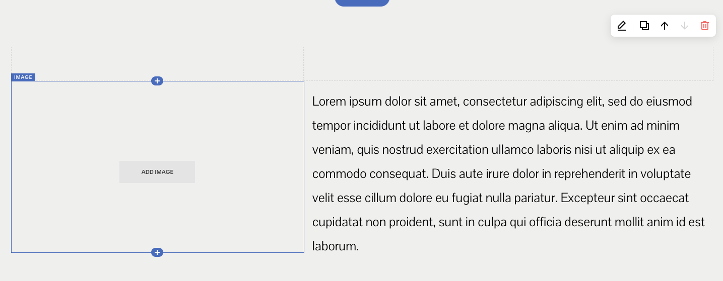
The simplest layout to start with an image and text block side-by-side. Begin by adding two spacer blocks to start with, arrange them side-by-side and determine which width for each. One will represent the width of your image and the other will represent the width of your text area.
Click the “+” sign right below the spacer block on the left to add your image block (or text block). Then do the same with the spacer block on the right.
The great news is you can always adjust these two widths even after you’ve added your image and text. Squarespace makes it beyond easy to adjust block widths of any type by simply dragging the left or right side of the block.
3. Creating equally-spaced columns to organize your content
Keeping in mind Squarespace’s 12-column grid format mentioned previously, you can easily arrange important content (think services or package pricing) into well-organized columns. Below I’ve started the layout process by adding 3 equal spacer blocks, each spanning 4 column widths (3 x 4 = 12).
Underneath each spacer block, I click on the “+” sign to add a content block… in this case and image block. I add an image and it immediately is resized to fit the width of the spacer block above.
Then, I click the “+” sign underneath the image to add a text block and it too is sized equally to the image above it. I can now delete the spacer blocks at the top that I started the layout with, and my images and text will be perfectly aligned as I’d originally designed.
4. Resizing an image in Squarespace
If you’ve got an image that’s too large for the page (ie. 1500 px width) and you need to make it smaller, you can simply add a spacer block on either side of it. Squarespace will resize your image and you can always readjust the spacer blocks’ widths to adjust the image’s size. Be sure to check your image file size - you’ll want to keep it under 500kb for faster page load time.
✨ Related post: How to properly size and format images for your website.
IMPORTANT NOTE:
It’s worth noting that the spacer blocks are removed in mobile view automatically, so you’ll need to think about that and how it affects your website’s layout when viewed on a mobile device.


