Responsive web design - tips to ensure your site is mobile friendly
As much as we may or may not like it, our day-to-day lives revolve around using a smart phone to stay connected - both personally and professionally. Whether for calls, emails, searches, or shopping, mobile devices are slowly edging out desktop computers as the leading sources of Internet traffic.
As a small biz boss, it’s more important than ever that your website is optimized for mobile view so that it looks and functions just as well as it does in desktop view.
Why you should optimize your Squarespace website for mobile
A mobile-optimized website will benefit your SEO ranking, reduce bounce rate, and improve audience engagement - a win all around!
Benefit your SEO ranking
When your Squarespace website has been optimized for mobile view, a visitor can easily navigate your site and find the content they’ve searched for. Search engines such as Google prioritize and rank websites that are mobile optimized because they provide an overall better user experience.
Reduce bounce rate
By having a mobile optimized website, your pages will be easy to navigate with readable text, accessible buttons, and pages laid out in an organized, logical format. This promotes a very positive user experience and reduces the chances of a visitor leaving your website out of frustration, and thereby reducing your site’s bounce rate.
Improve audience engagement
Even if your visitor has “found” your website, you want to keep them engaged with your content and wanting for more. With the increase of mobile devices as the first source of interaction with a website, providing the best possible experience in mobile view is key. And by designing your content to be as mobile-friendly as possible, you’re on the right path to achieving that goal!
How to optimize your Squarespace website for mobile view and create a better user experience
When you’re designing a website on a desktop computer, you have so much more real estate to work with for creative and dynamic layouts. However on a smartphone, you’re clearly limited to a much smaller screen space.
So how can you translate that larger design on a smaller scale while still achieving the same aesthetic and interactivity goals? How can you achieve Squarespace mobile optimization?
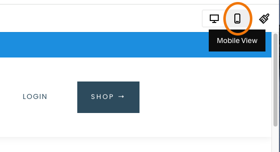
1) View your website on a mobile device
You’ll want to view your website as it would be seen on a mobile device and check out its compatibility.
There are a couple of ways to do this:
Open your website on multiples mobile devices using different browsers (Chrome, Safari, etc.).
Use the mobile view feature within Squarespace by clicking the icon in the top right corner of your screen.
In both cases, review all of your website pages in their entirety, making notes of what’s working and what’s not, including design flow, font sizes, and functionality.
Switch to mobile view in Squarespace
2) Prioritize website responsive design and make edits in mobile view
Note: We’re referencing Squarespace 7.1 Fluid Engine, which has an excellent mobile view/design feature.
A website with responsive design means that it automatically adjusts to fit the screen it’s being viewed on. If you’re designing your website on the Squarespace platform, the good news is it’s responsive by default.
*However* having said that, there are generally adjustments to make so that your website looks and functions at its best level on a mobile device.
Squarespace’s page editor, Fluid Engine, now makes editing the mobile view of your website easier than ever, without the need for custom code. It allows for a nearly fully independent design experience within mobile view, allowing you to really move things around - without disrupting the desktop view.
You can independently resize, layer, and move content blocks to better suit the user experience on a mobile device (check out my short demo video below).
You can also independently resize a section’s row count when editing in mobile view, and it won’t affect the row count in desktop view.
*Note that at this time, editing site styles such as fonts and colors is global - meaning any changes made will affect the entire website, both on desktop and mobile view. Also, image block and text block content (including text alignment) will be affected globally across your site.
3) Improve website page loading speeds for Squarespace mobile optimization
The speed at which your website page loads is influenced by several key factors. So taking those factors into consideration, you can help enhance the visitor’s experience on all devices.
Here are a few tips that will help lower your page load time:
Use custom thumbnails for embedded videos
If you have lots of video content, be sure to upload a custom thumbnail to your video embed block to prevent downloading larger files via Vimeo or YouTube.
Optimize your website images
Reduce your image sizes without sacrificing the quality to drastically decrease loading times. A great tool I use is tinypng.com. Whether your using jpg or png image files, you can use this free service to compress your images for a faster web page load time. Keep website images under 250K and large header or background images under 500K where possible.
Use minimal website fonts
From a design point of view, it’s generally best practice to stick with a maximum of two different fonts on your website. Squarespace offers a wide selection of fonts to choose from, so it’s tempting to want to use more. But from a design AND functionality perspective - stick with two. You’ll also decrease the chance of slowing down your page due to font-loading time.
Minimize website plugins and custom code
There are so many cool Squarespace plugins out there to help enhance your website’s design and functionality. But nearly all require additional custom code, which may slow things down. So try keeping those website bells and whistles to a minimum.
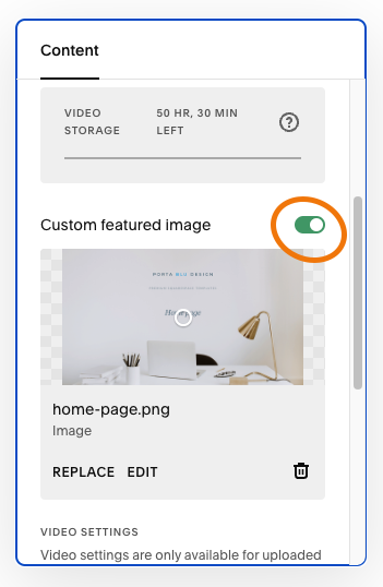
Use custom thumbnail for embedded video
4) Simplify your website navigation for Squarespace mobile optimization
Another great thing you can do to improve the user experience on your website is to simplify the navigation. This is true for desktop view, but becomes even more important for the smaller real estate of mobile view.
Think about how much a website is scaled down to fit within the width of a mobile device. If your website’s main header navigation is already crowded with many links, then it’s likely that it will be even more crowded and difficult to read or click on when being viewed on mobile.
Keep your main navigation to a maximum of five (5) links, and utilize drop-down links (sub-pages) when more pages are required.
✨Read more: 5 Must-have pages every small business website needs
Squarespace nicely converts your main navigation into a “hamburger” menu for mobile view. And when a user clicks on the icon, the mobile menu will appear with the site’s main navigation links.
Check to be sure the fonts are large enough and that the links are spaced out enough to be clicked on easily by a finger.
Good luck with optimizing your website in Squarespace. The benefits of your time invested will be long-term and your website will be better for it!
As always, reach out with questions… and happy designing!
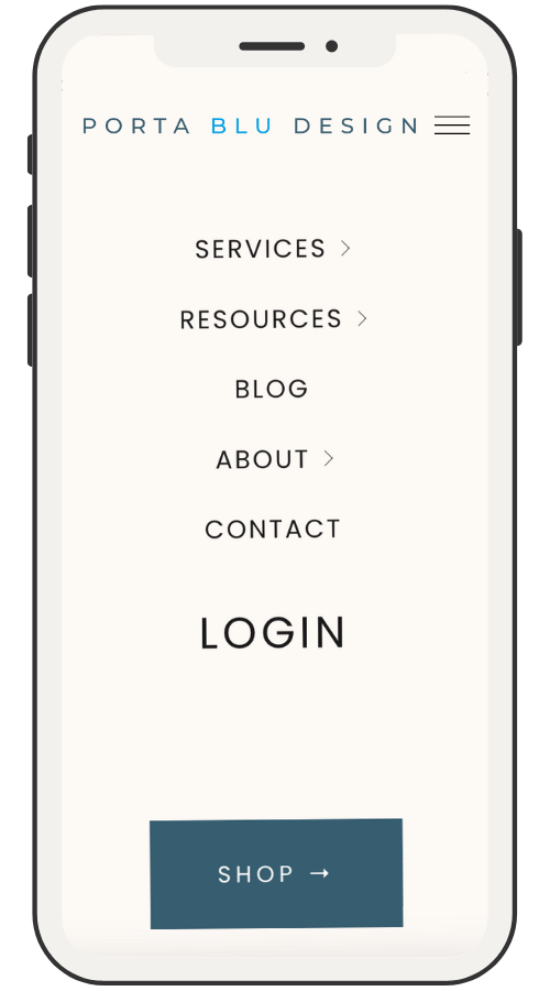
Simplify website navigation