A guide to setting up your Squarespace website color palette
For an interior design business to stand out from the crowd, it’s more important than ever to create a strong brand presence.
And a big part of that effort is establishing a cohesive, appealing color palette that carries through to all facets of your brand - including your website.
We often receive questions about how to select the right colors for a website, especially from those who don’t necessary have a brand color palette already in place. As a Squarespace expert, this is a process that I walk through with all of my website clients one-on-one. But we want to share this post with all of you DIY-ers out there too.
Our goal here is for you to be able to make the most of your website color palette using the built-in tools that Squarespace provides.
If you’re a small biz owner or entrepreneur DIYing your website, this post will help answer some of those color palette questions…
AND we’re throwing in a freebie too!
How to set up color palettes and color themes in Squarespace
Does this sound familiar?
You’re starting from scratch and stuck trying to select the best colors for your new website.
You have an existing brand color palette but not sure how to apply it to your website.
Your chosen website colors don’t seem to be flowing as well on your website.
Relax — you’re not alone.
Luckily, Squarespace provides fantastic tools to make the application of your website’s color palette easier than ever.
This website color palette tutorial covers the basics of:
✔︎ Identifying a harmonious website color palette for your brand
✔︎ Applying your brand color palette to your Squarespace website
How to choose the right color palette for your Squarespace website
Creating a simple mood board by using a platform such as Canva or Pinterest can be a powerful tool for inspiring the best color palette for your website.
By curating a collection of images, patterns, and textures that evoke the desired emotions and aesthetics of your brand, you can visually explore different color combinations and find what resonates most with your vision.
Look for visual inspiration (for example: textures, architecture, curated objects, natural landscapes, or minimalist interiors) and begin to gather a wide range of color palettes that spark creativity and align with your brand and your website's overall theme.
Create a digital mood board to inspire your website color palette
As an alternative to pinning photos and magazine cut-outs to a cork board, think about creating a digital mood board. We like to use Canva as a platform to quickly find and organize images, but you can go with whatever feels best for your workflow.
Color swatches created from photos in Canva
Collect inspiration from various sources, including photos, patterns, or illustrations, and save them to a new folder in Canva.
Narrow down your selections to a few key images that really capture the mood or feeling you want your website to convey - images that evoke emotions aligned with your brand's purpose.
Identify a color from each image that speaks to you, and make note of its color value (hex #). There’s a fantastic feature in Canva that automatically signals color swatches and their values for you based on a photo used within a design. We typically select four colors based on our selected images (see example Mood Board), two darker hues and two lighter hues.
Arrange the color swatches on your digital mood board, allowing them to visually interact with your chosen images.
Analyze the mood board as a whole, identifying recurring color patterns or themes. These colors and images will be the foundation for your website color palette and help convey your brand’s mood.
How to apply your brand colors to your Squarespace website
Open your website’s SITE STYLES by clicking on the paintbrush icon in the top right corner of your screen.
Then click on COLORS -> EDIT PALETTE.
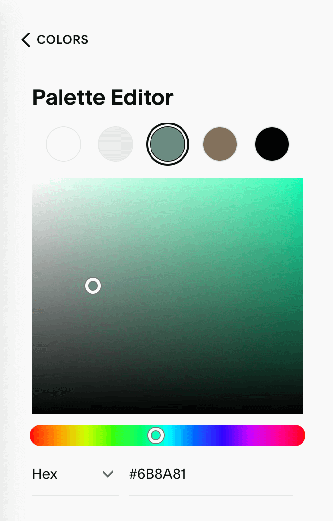
In the Palette Editor, Squarespace provides 5 primary color values to customize for your website. Those colors will be applied to the “color themes,” which we’ll discuss further down in this post.
Light neutral: Our approach here is to always assign the first color value as WHITE (#FFFFFF) or a variation that’s very close to white.
Light accent: For the second color value, we’ll choose one of the light colors from our sample mood board (#EAEAE9).
Main color: For the third color value, we’ve chosen one of the stronger brand colors from the sample mood board (#6B8A81).
Dark accent: The fourth color value will be the other stronger color from our sample mood board (#83715D).
Dark neutral: For the final fifth color value, we typically choose a black (#000000) or a dark-gray / near-black color.
These color values will be the foundation for your website. However the colors of individual sections and elements of your site can always be edited manually if needed.
Squarespace color palette editor
Customizing your Squarespace website color themes
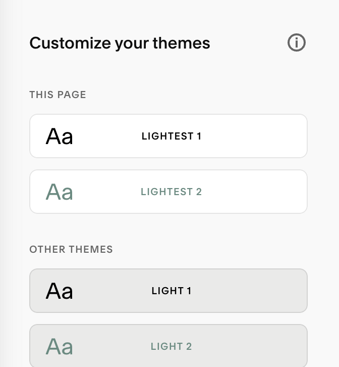
After you’ve added your 5 website colors to the color palette, go back to the main COLORS menu. You’ll note that your custom colors have now been applied to your website’s color themes.
In total, there are 10 color themes that you can customize. Color themes are essentially pre-formatted color combinations that you can apply with the click of a button to a specific page section on your website.
We don’t use every single color theme when designing a website. However it’s nice to have the option. Generally, we customize and use the “number 1’s” of the themes (Lightest 1, Light 1, Bright 1, etc.). That tends to provide enough variety and flexibility when designing website pages.
So let’s take a look at how to edit the individual color themes.
Squarespace website color themes
How to edit a Squarespace color theme
Click on the color theme you’d like to edit.
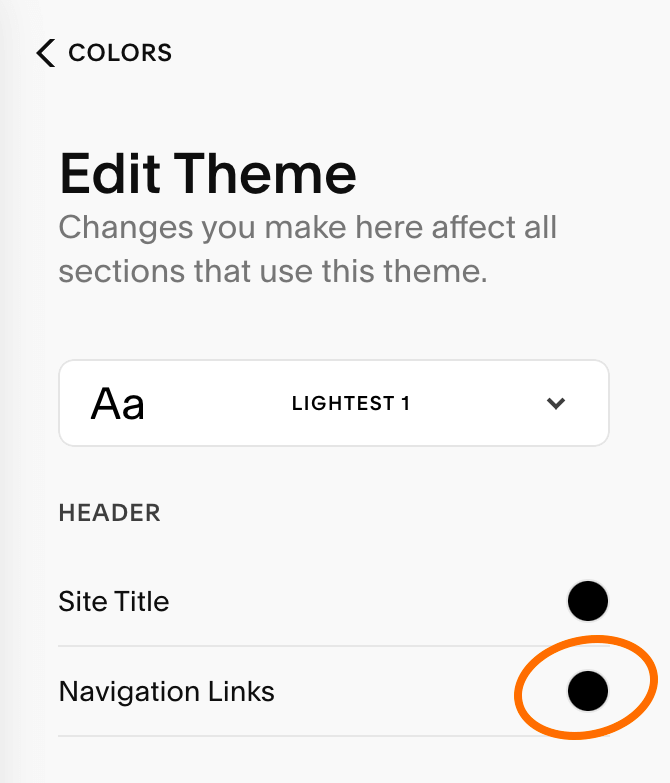
A very long list of options will appear under EDIT THEME, including options to modify the color of text, buttons, backgrounds, and much more. You’ll note that Squarespace has automatically added your color palette to each item in the list.
To change the color value of any item you see in the list, simply click on the colored dot. For example, if we want to change the Navigation Links from black to our sample brand “green”, we’ll click on the dot and select the color from our color palette.
You can also choose a custom color (that’s not part of your 5 main color values) by entering a Hex value or by using the color picker.
💡 Pro tip: Don’t get too crazy with colors here! Stick with your chosen brand colors. Moving forward, this will ensure a cohesive presence for your website and your brand.
Editing the color themes
Applying color themes to your Squarespace website
Once you feel comfortable with the various color themes, you can now apply them to any section of a website page.
Here are the simple steps:
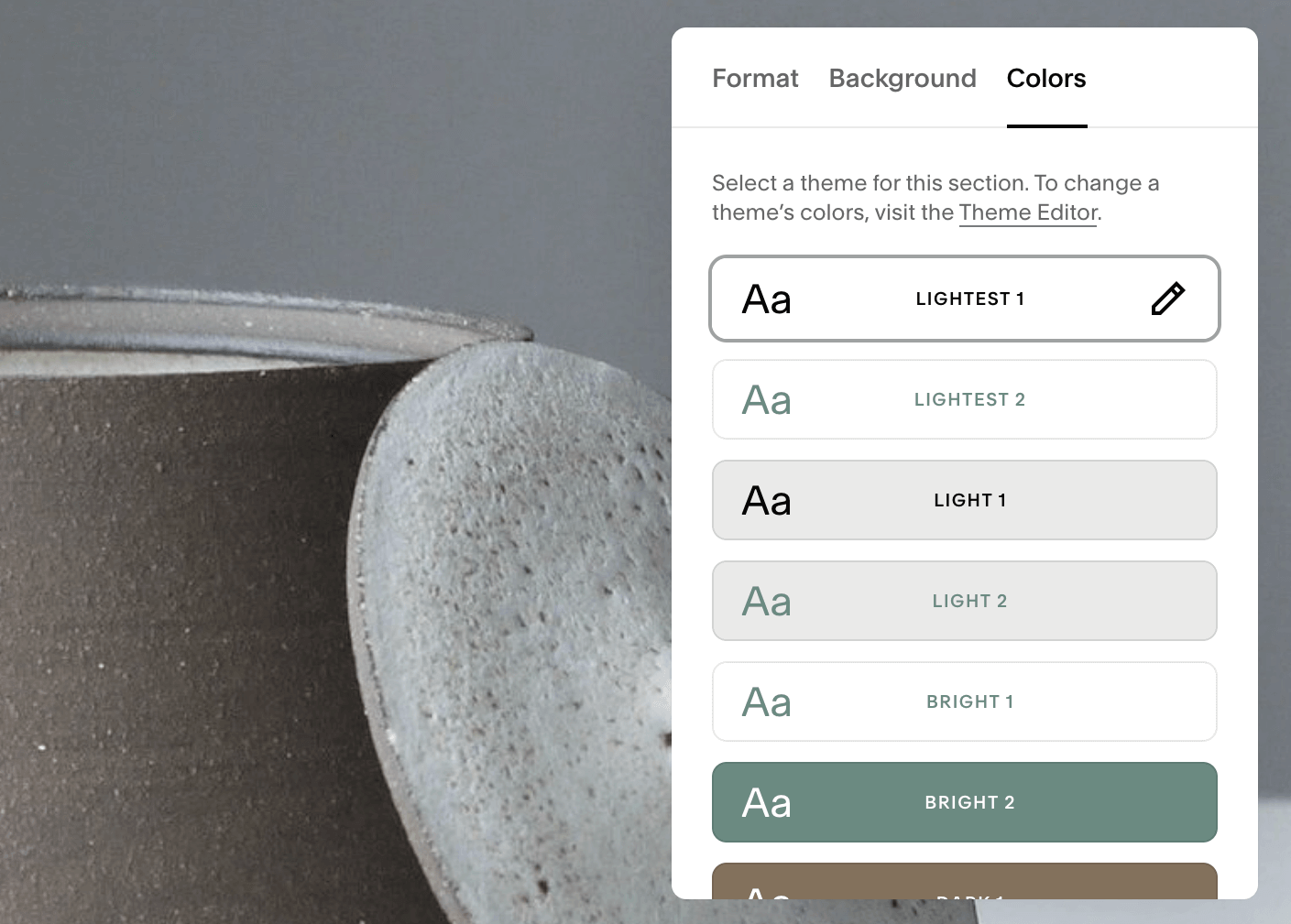
While hovering over one of your page sections, click on EDIT SECTION.
Then click on the COLORS tab. You’ll see a familiar list of the 10 different Color Themes that have been set up.
Click on the Color Theme that you need for that particular page section. You’ll see the section immediately update with the colors that have been assigned to the color theme. This is a great way to test-drive the color themes for your page sections.
Apply color themes to the website
And that’s it!
If you need to revert back to or change the section’s color theme again, simply follow the steps above.

