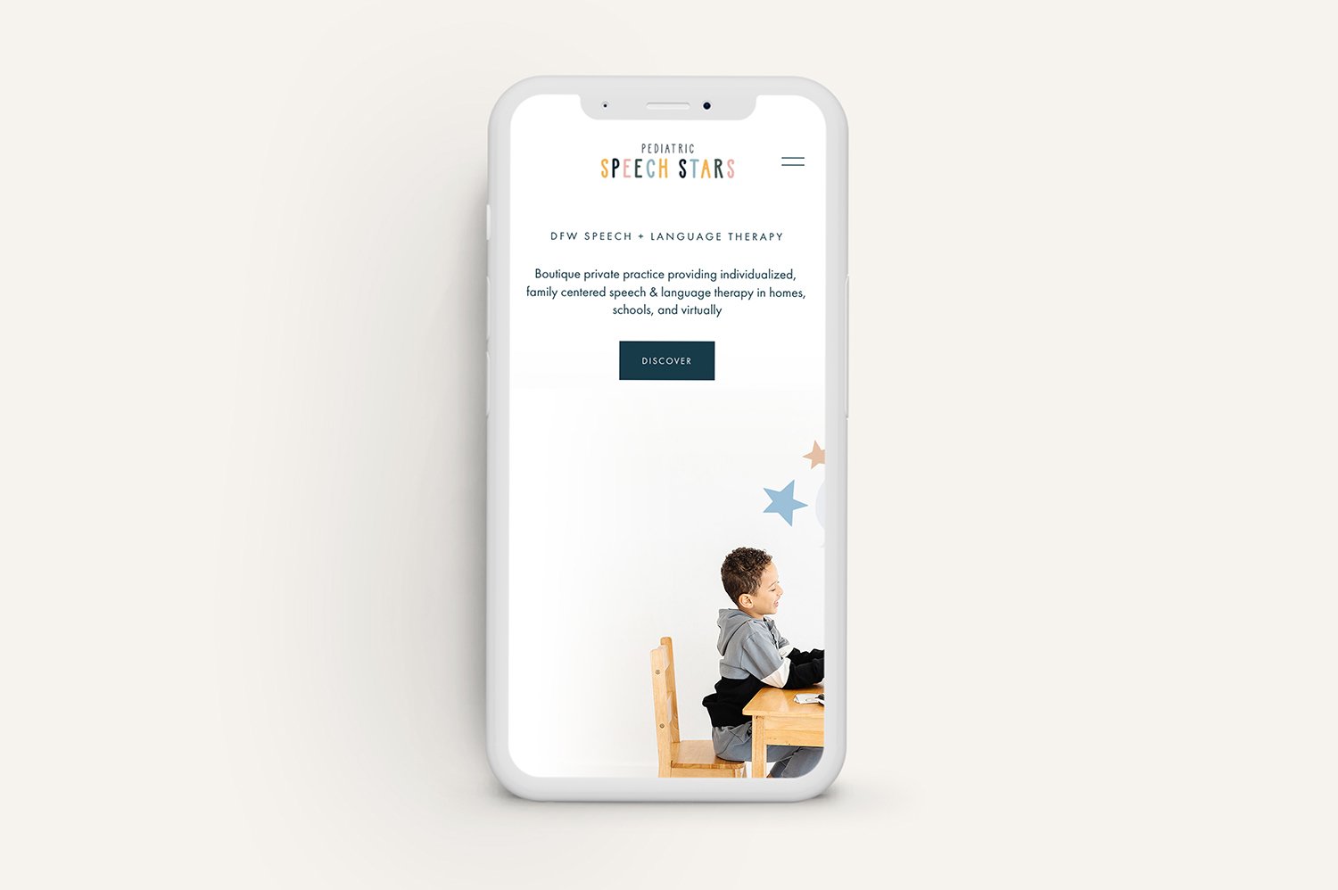
Change a banner image for mobile view in Squarespace
**UPDATED 2023
I recently completed a website for a client who had some beautiful branded professional photography that we incorporated into the design.
The images were mostly landscape-oriented (horizontal), which was perfect for our layout when the website was viewed on a desktop or laptop.
However, when switching to mobile view, the header image was now being cropped, which happens automatically, and just didn’t look right.
Luckily my client’s photographer had given her some of the branded images shot in portrait-oriented (vertical) format, which we were able to use as “replacement” images in mobile view for most of the website.
If you’re handy with Photoshop or Canva, you can also manually edit an image and modify it to be more “vertically” oriented, which is what we ended up doing for some of the images.
We added some custom CSS to tell browsers to swap out the main banner image with a new vertically-oriented replacement image when the website is viewed on a mobile device.
So how do you force the background header image to change to an alternate image in mobile view? Let’s walk through it together.
How to change the background banner image for mobile view in Squarespace 7.1 using custom CSS
This is what the header image for the client’s home page looks like when viewed on a desktop or laptop. As you can see, the background image was photographed in a way to create some “negative” space in which we could overlay text.
But when viewed on a mobile device, the image shifts and we can’t see most of it. Even if we move the image’s focal point, it just doesn’t do the trick and we lose a good bit of the background.
Replace the banner image on mobile view in Squarespace 7.1
STEP 1
In order to solve this problem, create and save a separate header image in a vertical format, better suited to mobile view, which will replace the header image you’re targeting.
STEP 2
Within your Squarespace 7.1 website, navigate over to the CSS panel by clicking on DESIGN -> CUSTOM CSS. There you’ll find a large field where you’ll add some custom code.
STEP 3
Copy and paste the following code in the CSS field:
@media only screen and (max-width: 640px) {
#CollectionID {
#page .page-section:nth-child(1) .section-background img {
opacity:0
}
#page .page-section:nth-child(1) .section-background {
background-image: url(IMAGE-URL);
background-size: cover;
background-position: center;
background-repeat: no-repeat;
}
}
}
The code above will be applied only when the page is viewed on a mobile device. This is accomplished with the first line of code (@media… ), which dictates the mobile breakpoint and is telling the browser to apply this code only when the screen size is 640px or less (mobile view).
STEP 4
We’re now going to replace the portion of the code above that’s in bold, called the Collection ID.
Because Squarespace makes use of unique identifiers such as Collection IDs, Page IDs, and Block IDs, the easiest way to find the ID that you need is by installing a free Chrome extension - Squarespace Collection/Block Identifier - I use this extension daily! With the extension turned on, you can quickly identify the unique number of the specific block, section, or collection you want to target with CSS.
Once you’ve identified the Collection ID of the page you’re targeting, paste it into the CSS code, replacing the #CollectionID.
STEP 5
Next, let’s upload the image that you’ve created and saved to replace the main banner image in mobile view.
At the bottom of the Custom CSS field, you’ll see a button called Manage Custom Files. Click on that, and select your mobile-view image from your files. This will upload the file and save it.
STEP 6
Click back inside the Custom CSS panel and with your cursor, highlight the text between the parenthesis that says IMAGE-URL (be sure to ONLY highlight this text, and not the parenthesis). Then hit delete.
With your cursor still in between the parenthesis, click on Manage Custom Files again, and click on the image file you just uploaded. You should then immediately see the file’s link populate between the two parenthesis where your cursor was.
That’s it! Check your work by clicking on the mobile preview icon within Squarespace and see the results.
If you enjoyed this post, you’ll also like:
⚡️ How to use two font styles in one Squarespace heading
⚡️ 7 Useful Squarespace website plugins to check out
⚡️ How to remove the header and footer on a single Squarespace page


